Sometimes - before you design the website, you need to design or redesign the visual branding. After all, it's going to affect how the website looks.
In simple terms: your logo and tagline are the fundamental elements of your visual brand identity. They're the visual manifestation of how you want to be perceived by your audience or customer. And you want yours and your audience's perception of your identity to be as closely in-tune as possible.
In order to achieve that match and stay on-message, you need solid, well-considered visual identity design. It will become a crucial part of the brand that you'll build. We're pleased to say that Ionic are experienced in the visual design of customers' brand identities. Often referred to as logo design.
Identity/Logo Design Case Studies
Identity Design: APC
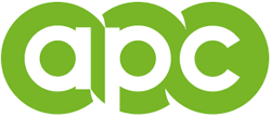 We gave them a design that utilised strong positive and negative shapes, which would give a good silhouette when presented in a solid colour against white - or reversed as white on dark. » read more
Identity Design: Easymoves
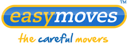 A more modern and kinetic-looking logo for an international removals company. The old logo said nothing - visually - about the company. In re-designing the logo - which was mainly a typographical and colour change - we went with the concepts of energy, speed, positivity and friendliness: core principles of the company itself. » read more
Identity Re-Design: AHR
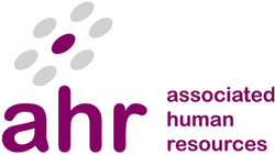 Once again, a brand refresh for AHR greatly improved and streamlined the re-design and production of their new website. The primary elements were already there, it was a case of infusing them with the personality, warmth and friendliness of the company's brand; and re-shaping them into a better composed design. » read more
Identity Re-Design: NAI
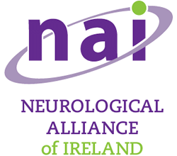 NAI's branding had lost visual focus and consistency, so Ionic updated the logo and typography. The client preferred not to make a complete break from the basic concept so familiar to its audience and members. The NAI acronym was changed to a friendlier lower-case sans-serif, with a new slab-serif typeface used to replace the old-fashioned serif font of the Neurological Alliance of Ireland text - which was out-of kilter with the modernistic main motif. » read more
Identity Re-Design: Synergy Engineering
![]() Strong under compression: The new version was based on sturdy engineered-looking forms, with a sturdy engineered-looking and professional typeface to match. » read more
Strong under compression: The new version was based on sturdy engineered-looking forms, with a sturdy engineered-looking and professional typeface to match. » read more
Identity & Print Design: Carron+Walsh
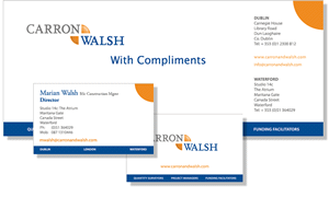 Ionic delivered a comprehensive Identity Design Service to Carron + Walsh. "We were particularly pleased with the development of our business logo and how it fits within our marketing material" - Denis Carron - Director » read more
Identity Re-Design: ISIN
 We refreshed and improved ISIN's logo in tandem with the redesign of the website. ISIN are about innovation, so we heightened the impression of energy and positivity with a bright sky-blue and a warm orange. » read more
Identity Re-Design: AIB Seed Capital
 A design modification: The website was to appeal to a younger entrepreneur - around the 30+ mark. We considered the client's existing visual identity and found that the typography was in need of attention to appeal to that audience. » read more
Identity Re-Design: The Smallest Things...
 Obviously we can re-design from scratch, but we'd like to show you how some of our clients saw great improvements to their logos with some small changes. » read more
Identity Design: Technology Cluster South East
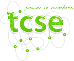 All technology begins as a human thought, often energetically worked out by hand on paper. » read more