Carron+Walsh: Identity Re-design Case Study
Ionic delivered a comprehensive Identity Design Service to Carron & Walsh.
Background
We commissioned Ionic to create a complete identity design for our business including stationery and website design. By delivering a comprehensive design package, Ionic created a consistent theme through all of our marketing platforms. We were particularly pleased with the development of our business logo and how it fits within our marketing material.
Denis Carron - Director, Carron+Walsh
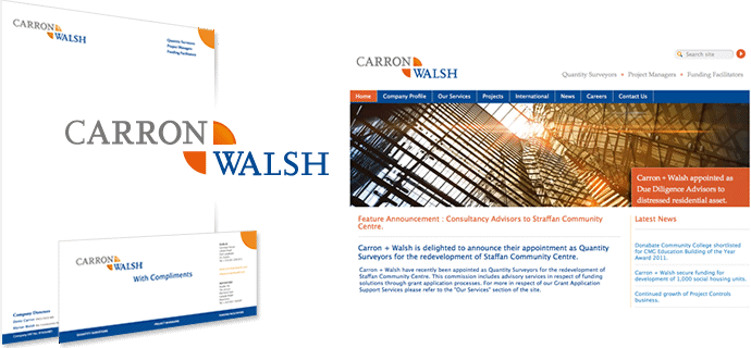
Carron + Walsh are Quantity Surveyors, Project Managers and Funding Facilitators. They had originally discussed the design and development of their website; but early in the process they realised that they also needed to redesign their logo. With a redesign of their stationery becoming the logical extension of that task: the website revamp also became a visual identity redesign project.
Starting points
An explicit + motif in between the directors' names was already in use in their visual branding materials. Now the client wanted to see how the logo could be improved as an integral part of their visual redesign which included their website and stationery and business cards. Stronger, "a bit of colour" and "not too busy". It would have been easy to go for a minimalist solution.
![]()
Design Solution
 The type was re-organised and we worked on integrating the + symbol into it in a way that looked more designed and interesting, and less like simple text. The plus symbol is:
- a simple metaphor for quantity surveying
- a connector between the partners' names and
- symbol of the positive.
To enhance this sense of positivity and energy, we went less minimalist and off-set a fairly corporate blue and grey with a sunny, complimentary orange.
Accentuate the Positive
We used a more modern typeface but retained the classic serif look. The 'plus' motif was integrated wholly differently than before. Rather than simply keeping the symbol in between the partners' names, we suggested its shape with the forms of the names themselves - particularly in the N but also the top of the W - and just two orange quadrants. It's a more subtle connector, and is given added visual interest in being an implied negative shape. The 'plus' was also carried over to the website in some of its finer details.
Branded Materials
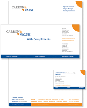 In terms of the stationery and business cards we wanted to keep things well organised and very professional looking. Once again, a minimalist approach typical of that favoured by architects would have been an easy option but we had the element of warm energetic colour to accommodate too.
The colours are as well organised as the content and help the eye to scan the quite large amount of information that had to be included on the printed materials, using both contrast and chromatic connection.
Finally, we supplied the client with a package of logo files in various formats and sizes with documentation; for their own in-house use, in documents and presentations.