NAI: Identity Re-Design Case Study
Once again, a brand refresh for AHR greatly improved and streamlined the re-design and production of their new website.
The primary elements were already there, it was a case of infusing them with the personality, warmth and friendliness of the company's brand; and re-shaping them into a better composed design.
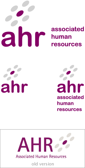
The circles motif sat nicely above the ascender of the 'h' - especially once we had switched to the friendlier, less formal lowercase format for the 3 letters.
When the 3 letters sit alone with the motif we have a pleasant more classic pyramidal form for the logo.
The new rounded typeface set in a bolder lowercase has no sharp edges or corporate looking lines and angles - it's friendlier and it now fits with the circles motif.
The Website
With this relatively simple redesign for the logo approved, and with a better feel feel for the visual branding it was far easier to create a design for the new AHR website which was attractive and on-brand with the company's personality and aspirations. Why not read about that next stage: the website re-design