Visits by mobile and touch screen devices are the fastest growing audience sector, we make sure your website looks at its best in all devices.
Ethan Marcotte, author of Responsive Web Design wrote,"Now more than ever, we're designing work meant to be viewed along a gradient of different experiences. Responsive web design offers us a way forward, finally allowing us to 'design for the ebb and flow of things.'"
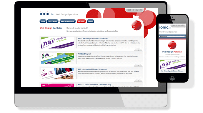
Same Website, same HTML: But Radically Different Devices
In short: Responsive Web Design involves designing and building a website in a way that works optimally on any device.
Any device
Like this website, on whatever it is that you're viewing it on right now!
Last year, traditional PC sales were down. Why was this? Because an ever-growing number of people are relying more and more upon smaller hand-held and mobile devices. A touch-screen revolution is underway and sales of tablets are rising.
What's all the fuss about?
It's been said by some that 2013 is the year of responsive design, so why now? The answer lies in user behaviour and the sudden growth in the numbers of devices in use:
The way that people are using mobile devices is changing; users are switching from reading news and information in apps to using web browsers in mobile devices. Many users are actually replacing desktop computers with mobile devices and tablets.
What's the solution?
Ionic have responded in three ways to the challenges of achieving optimal user experience across the growing range of device formats:
- Changing our design approach – Adding the constraint that anything we do needs to work well across all devices as a built in requirement rather than an optional extra.
- Using Responsive design – Flexible images and Fluid page layouts using media queries which detect the screen resolution of the device.
- Using Adaptive design – Changing what is delivered to the device by detecting the type of device and adapting the website's behaviour appropriately.
How does this change things?
Ionic have produced a solution for implementing custom websites which minimises what our customers need to think about when planning their websites. We still have to consider the behaviour of custom design and functionality across more devices but, our implementation framework now enables us to do this in a more cost-effective way.
Talk to Us : )
If you'd like to talk to us about creating a new website - or even adapting your existing one - feel free to phone us or email us below to arrange a free consultation.