APC: Identity Design Case Study
APC, a pharmaceutical company needed a large package of design work done for an upcoming tradeshow.
They needed a website, an exhibition stand, business cards and a brochure. First though, they needed a visual identity.
We gave them a design that utilised strong positive and negative shapes, which would give a good silhouette when presented in a solid colour against white - or reversed as white on dark.
Key Concepts
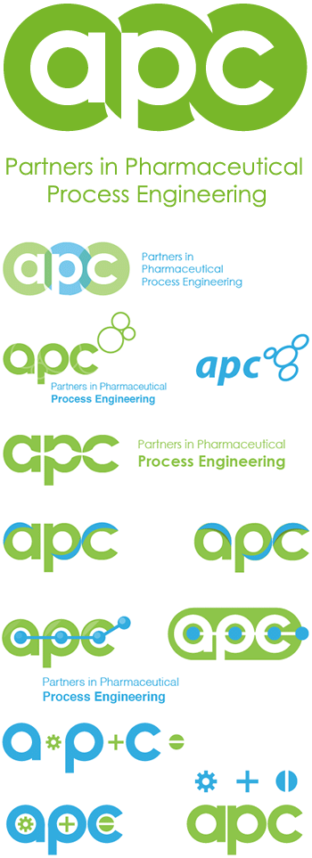
Processes, Pharmaceuticals, movements and dynamism.
In the unused concepts, you can see forms that suggest chains of molecules, fluids flowing from one point to another, cells and even a gear motif for the industrial process metaphor.
The basic forms were based on:
- The rounded typography which we designed and drew ourselves
- The concept of a 'tablet' or 'pill'
- Components of a process - in motion and feeding from one into the other. This was accentuated by the four sharp, curved cutouts
- It also has a rope - or chain feel to it - further emphasising a strong continuous process
We also used green, which is a traditional pharmaceutical colour