 Synergy Engineering: Identity Re-Design Case Study
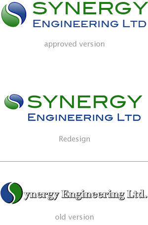
As part of a website re-design project, we took the logo concept already in existence and greatly improved on it.
The logo that they already had, hadn't been well maintained and the typography - and readability - had become somewhat confused. The new version was based on sturdy engineered-looking forms, with a sturdy engineered-looking and professional typeface to match.
Strong under compression
In our initial re-design, the typography and Synergy's ying-yang motif were adjusted to give the whole image a sort of compressed potential energy. In the end the client went with the motif in it's uncompressed fully-round form.
It still works extremely well with the following key properties and concepts:
- Professional
- Sturdy
- Well-balanced forms
- Well-balanced colour
- Brighter, purer colour
- Has clarity of form and legibility